The Brief: Yoba Noodles is a food manufacturing company focused on convenience noodle-based products. Yoba's strategy started focusing on the flavor and the small ingredients that make authentic ramen great. They wanted to break into the American market but didn't know how to stand out.
Goals: Create a logo, package designs, and identity for the brand. Focus the new design and media on a family-friendly client base that values affordable fun, and varied food.
The Process

The logo took on the shape of a Narutomaki Noodle. The logic is that Yoba is all about making each small ingredient shine in their food. So by making the logo into one of the small ingredients, it pushes their brand message forward.

Typography

Co is a typeface that is geometric but soft at the same time. This allows it to feel organic but overall has a good structure. The headline version is soft like noodles, but having a text version allows the brand to maintain the structure when it text needs to be more functional.
Color Pallete

Yoba's color pallet was decided on being bright and colorful. The little ingredients pop out of the bowl when eating the ramen, and I wanted the palette to reflect that idea.
Print Media and Outdoor Campaigns
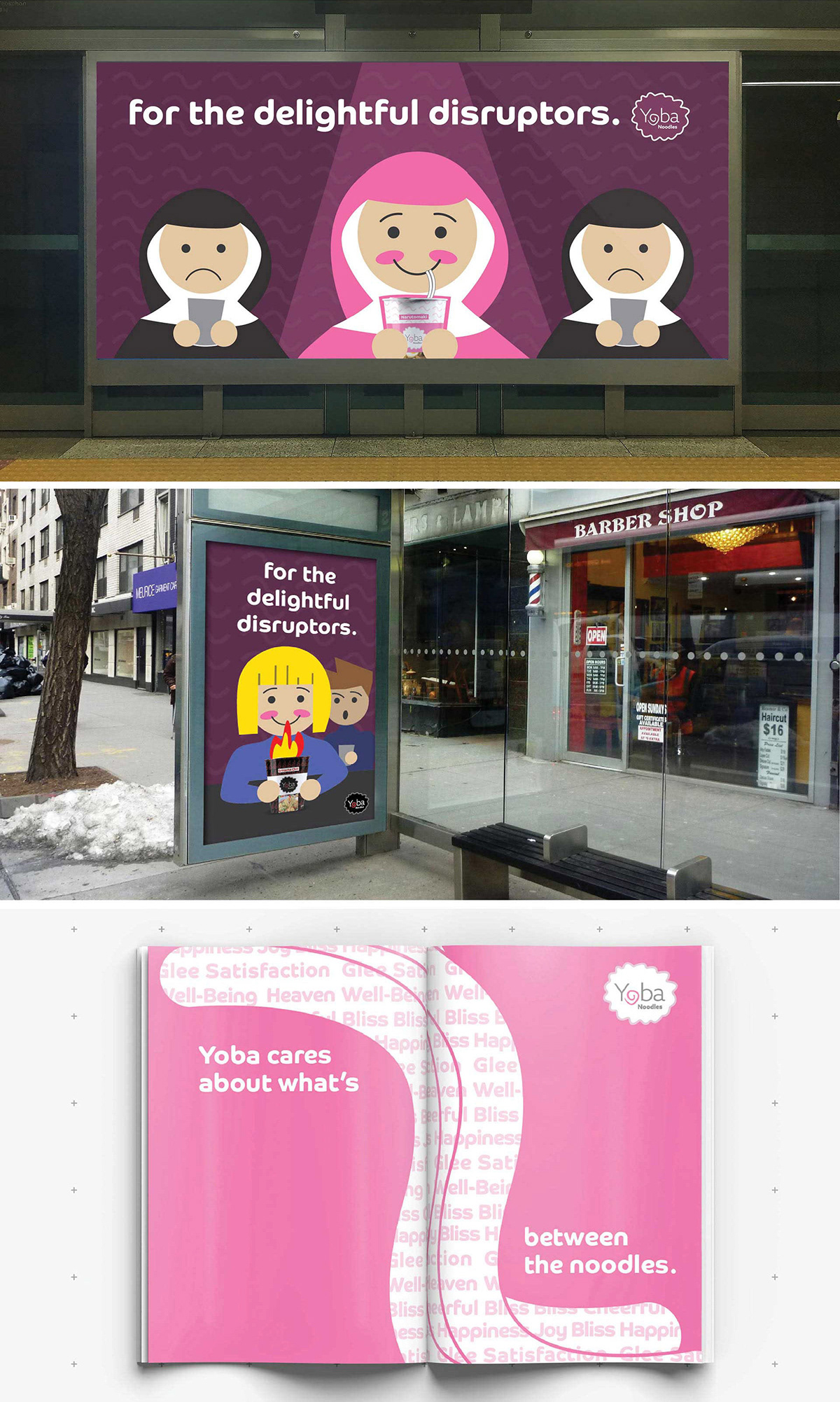

Instore-Display

Package Designs

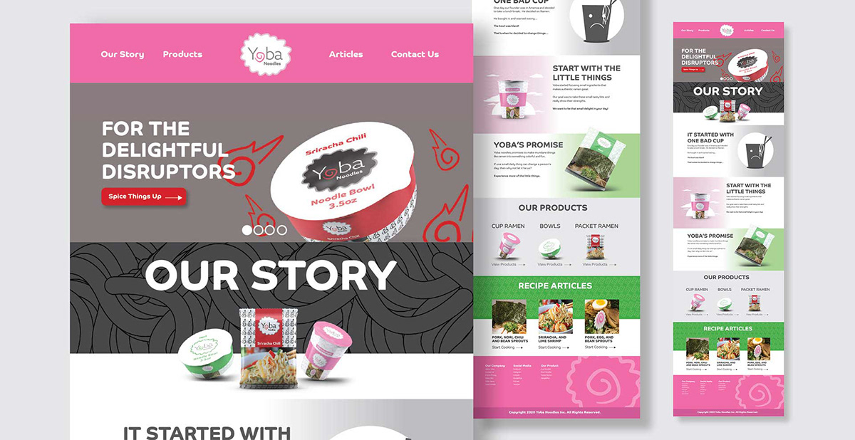
Website